ComfyUI 上 Text G 跟 Text L Prompts 的關係
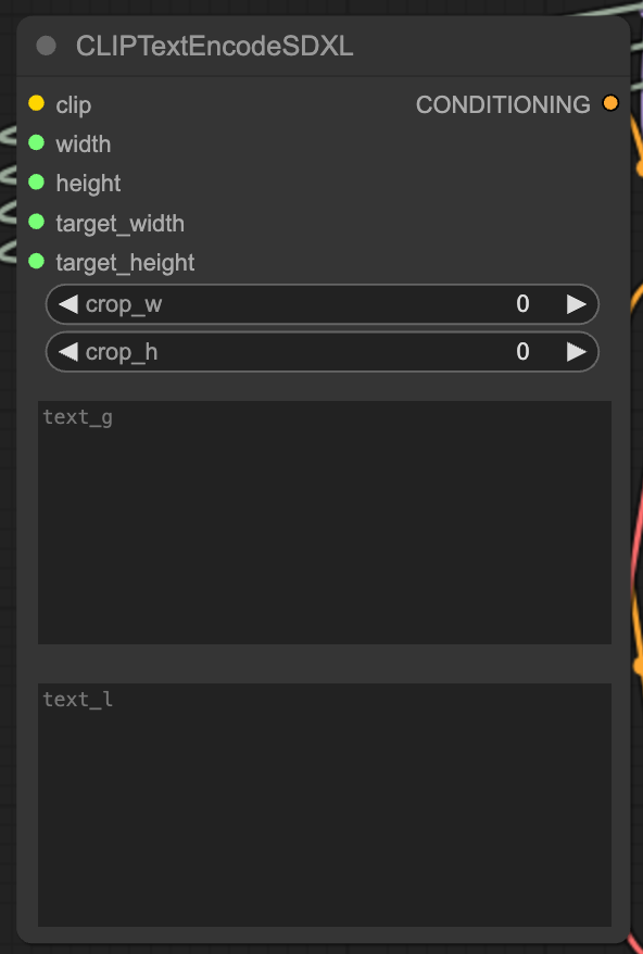
在 ComfyUI 上使用 Clip Text Encode SDXL Node 時,會兩個不同的 Prompts 輸入格,一個叫 text_g 另一個叫 text_l,兩個框格輸入相同的 Prompts 也會有不同的效果,到底兩個 Prompts 之間有什麼關係,我們又應該在兩個格中輸入什麼 Prompts 會比較好呢?

在 ComfyUI 上使用 Clip Text Encode SDXL Node 時,會兩個不同的 Prompts 輸入格,一個叫 text_g 另一個叫 text_l,兩個框格輸入相同的 Prompts 也會有不同的效果,到底兩個 Prompts 之間有什麼關係,我們又應該在兩個格中輸入什麼 Prompts 會比較好呢?
以下就來比較一下兩組 Prompts 分別輸入到 Text G 及 Text L 的效果吧。
ComfyUI 設置
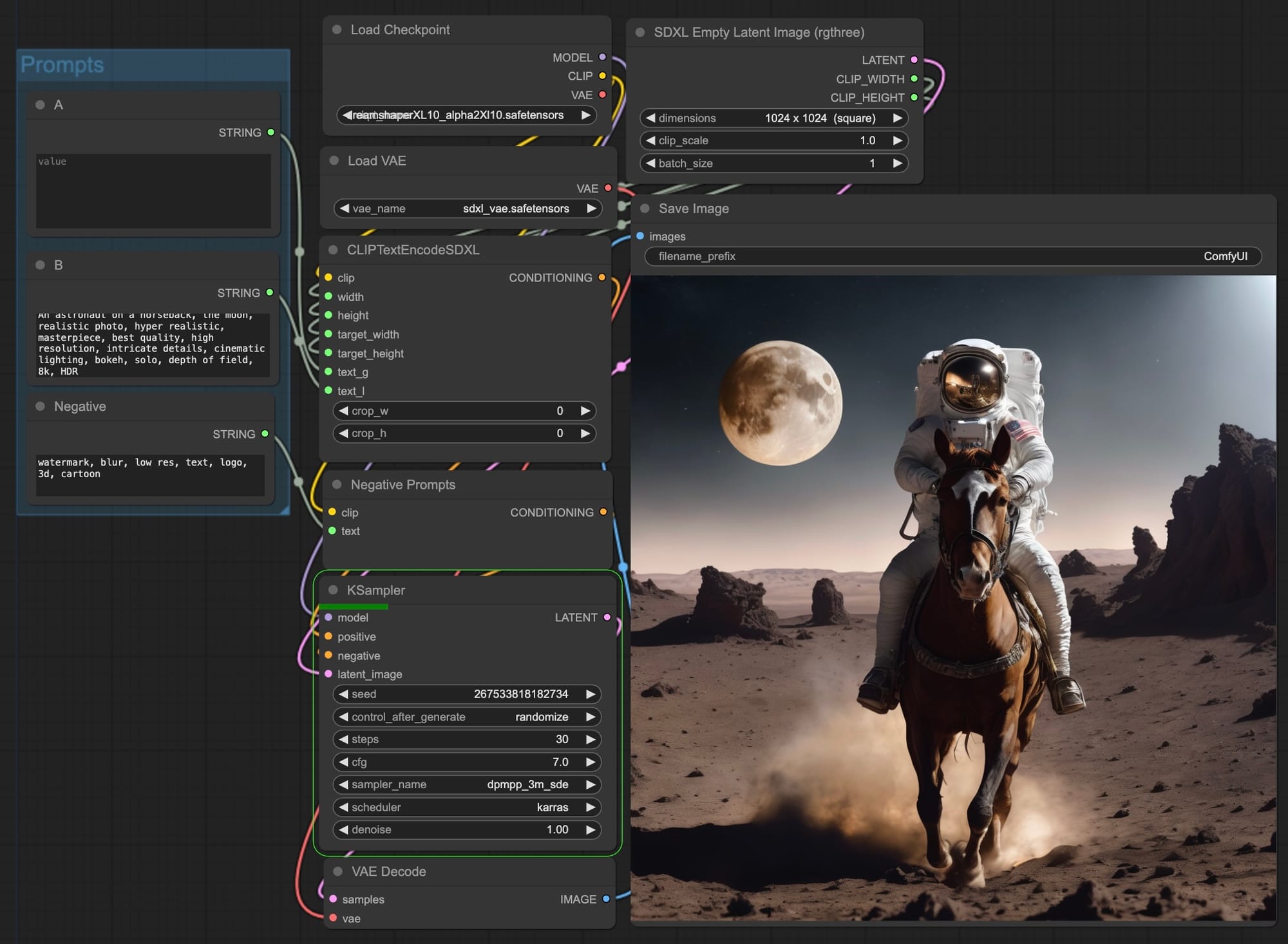
這個測試使用 Dreamshaper XL 為 Checkpoint,生成 1024 x 1024 的圖片
Prompts
首先我會準備兩組 Prompts,A 是主體描述的 prompts,B 是強化畫面的 prompts。
A1: 1girl, red hair, wearing school suit, school, blue sky
A2: ginger cat, indoor, living room, sitting on sofa
A3: An astronaut on a horseback, the moon
B: realistic photo, hyper realistic, masterpiece, best quality, high resolution, intricate details, cinematic lighting, bokeh, solo, depth of field, 8k, HDR
Negative Prompts: watermark, blur, low res, text, logo, 3d, cartoon, anime
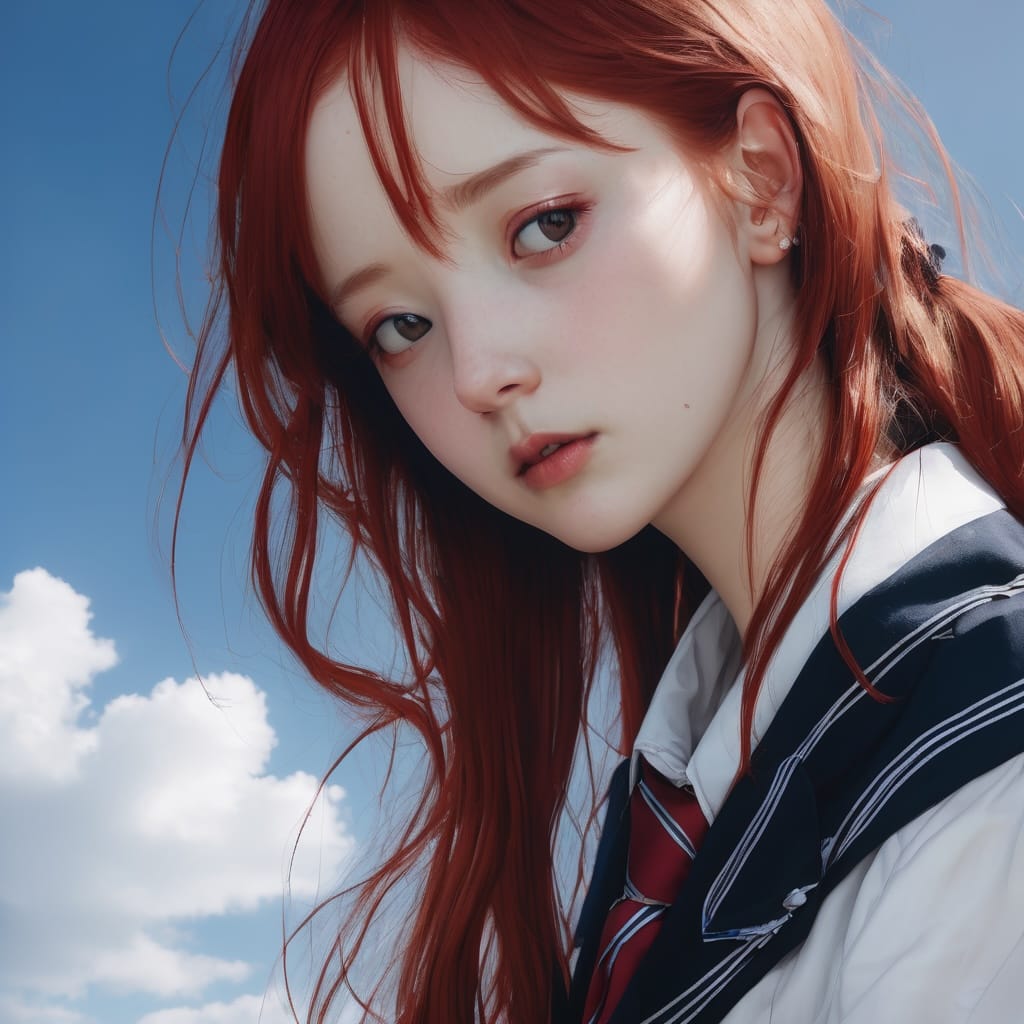
Test 01
第一個測試是 A + B 都放到 Text G 中而留空 Text L。一切看起來都很好,跟 prompts 的描述也相同。
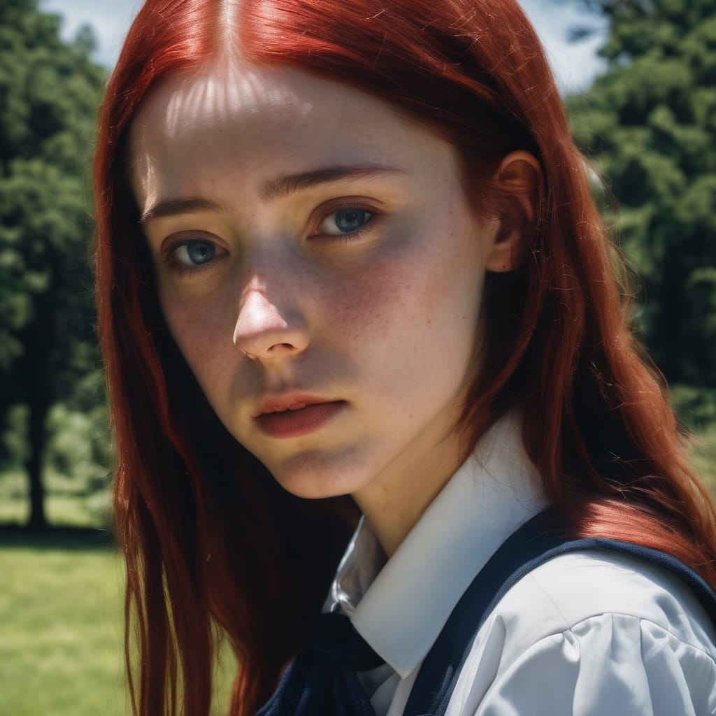
Text G: A + B, Text L: Nothing
Test 02
第二個測試是留空 Text G,將 A+B 都放到 Text L。女孩沒有校服,也沒有藍天,貓咪看起來趴在地墊上,太空人沒馬,地面著火是什麼回事?
Text G: Nothing, Text L: A + B
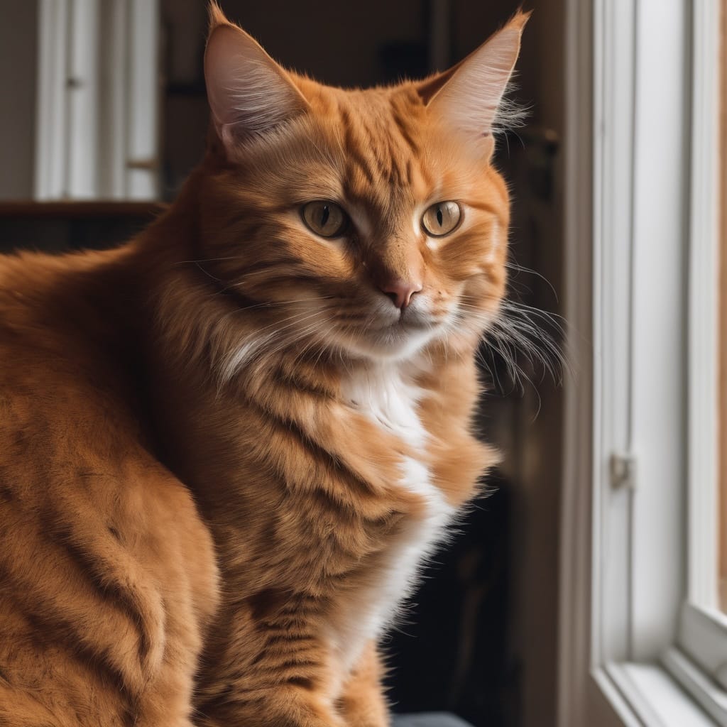
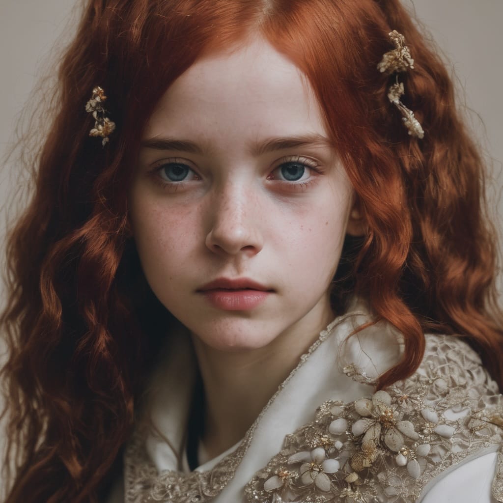
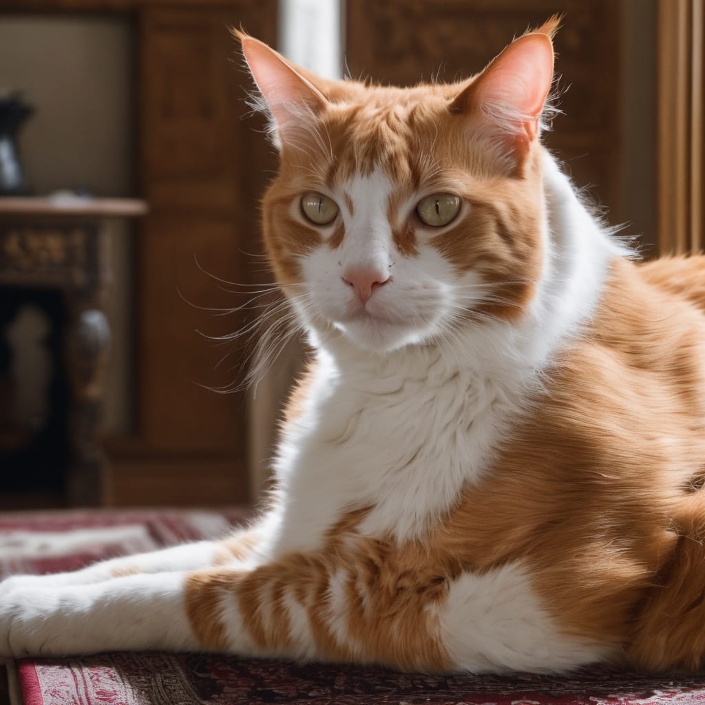
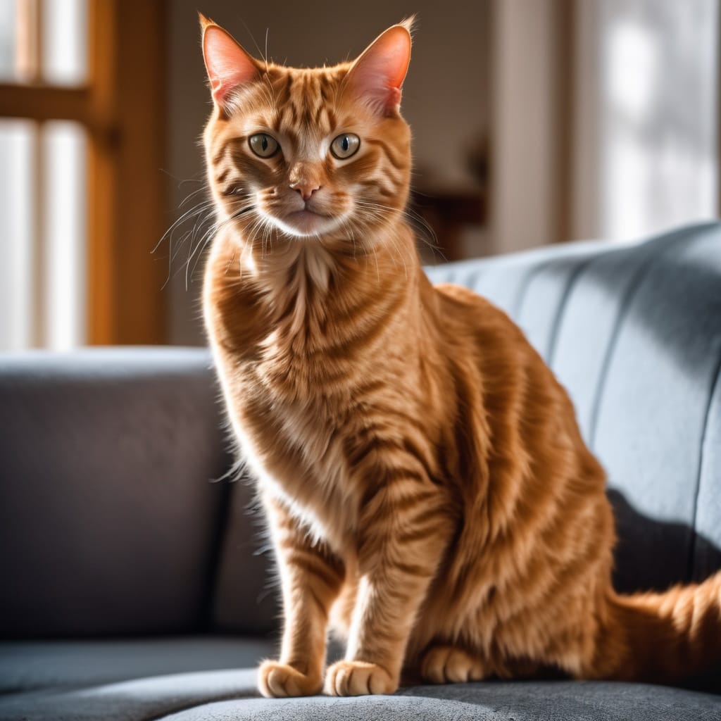
Text 03
第三個測試是跟 Text G 放 A,Text L 放 B。女孩有校服有藍天,就是樣子有點怪,貓貓趴在沙發上完美,太空人在月球,但沒有騎馬。
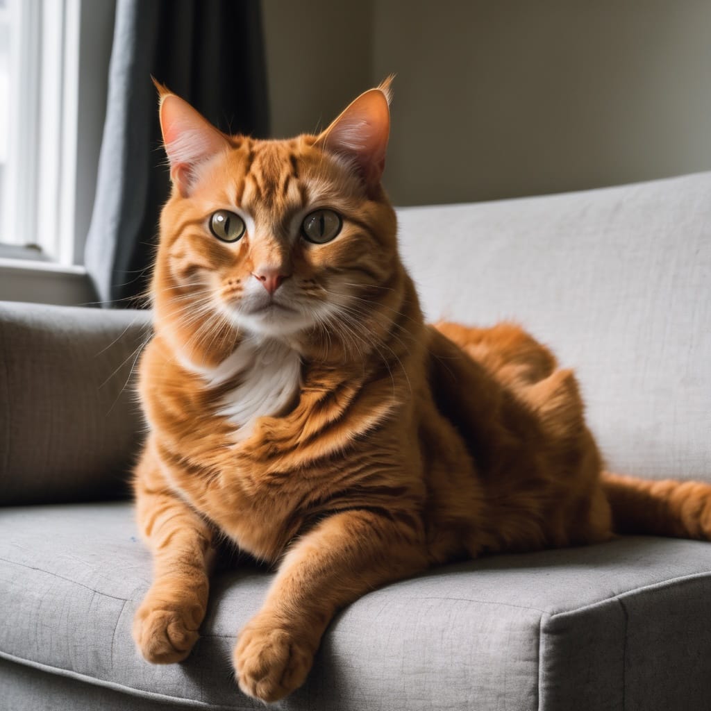
Text G: A, Text L: B
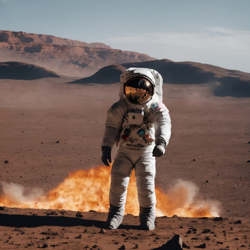
Test 04
第四個測試是跟上面相反, Text G 放 B, Text L 放 A。女孩看起來有點老,不知是不是穿校服,但一定不在學校,貓咪坐在地上,太空人在騎馬,但不像在月球也見不到月球。
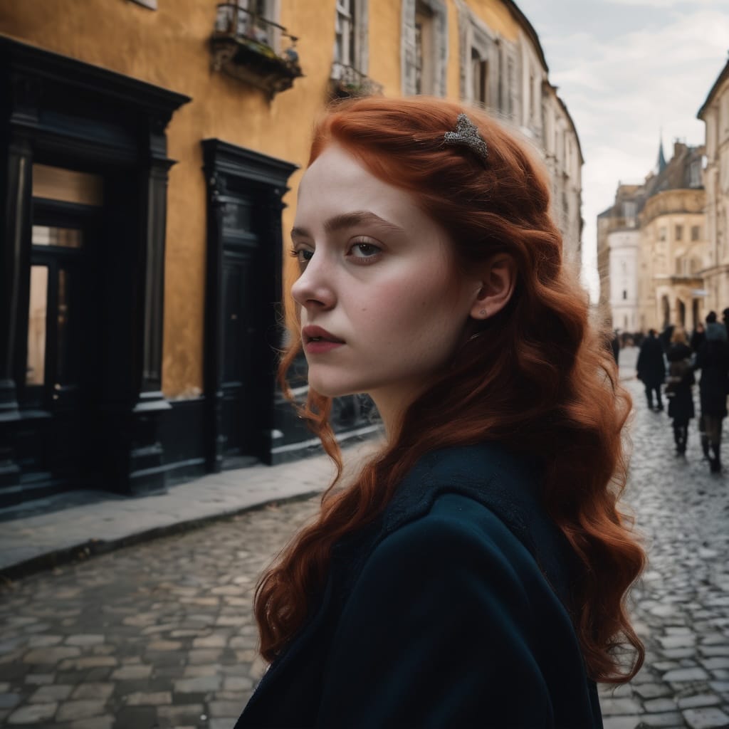
Text G: B, Text L: A
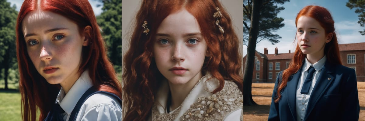
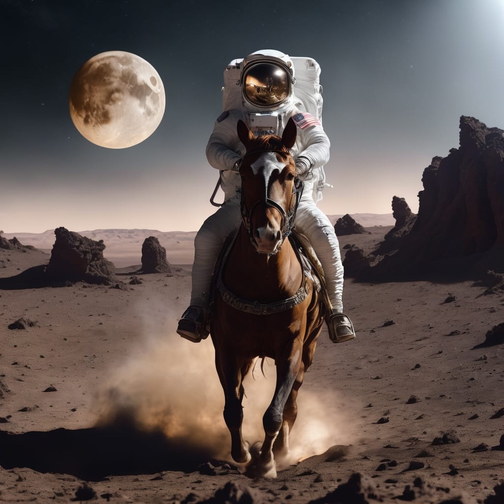
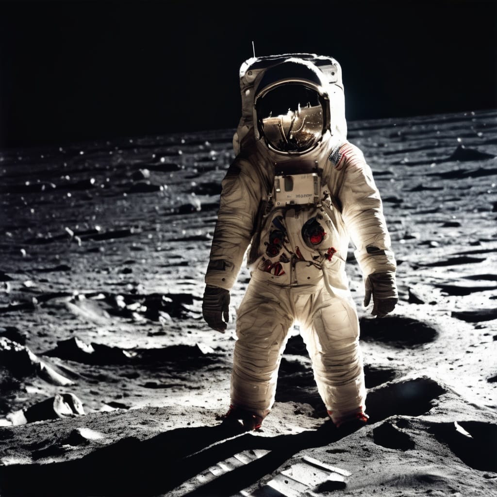
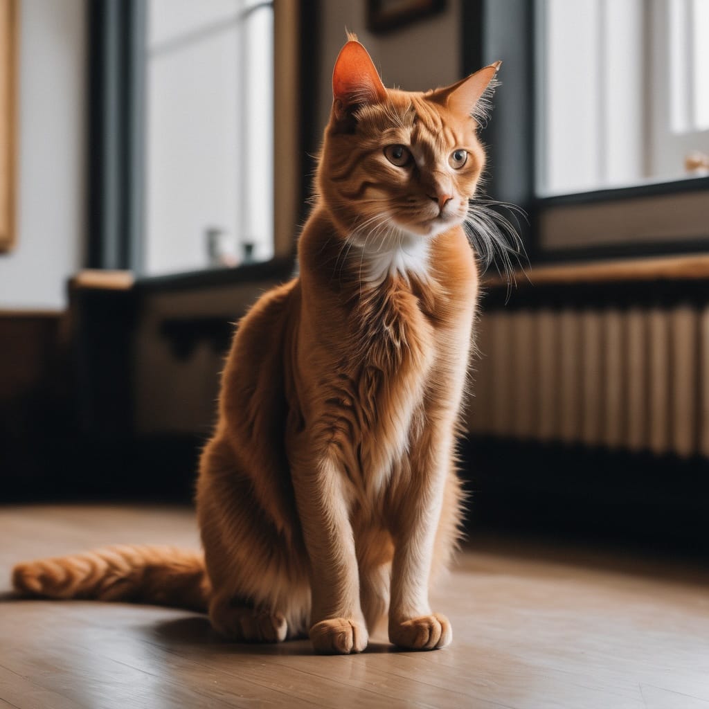
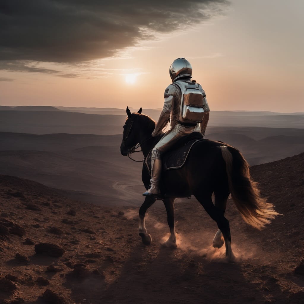
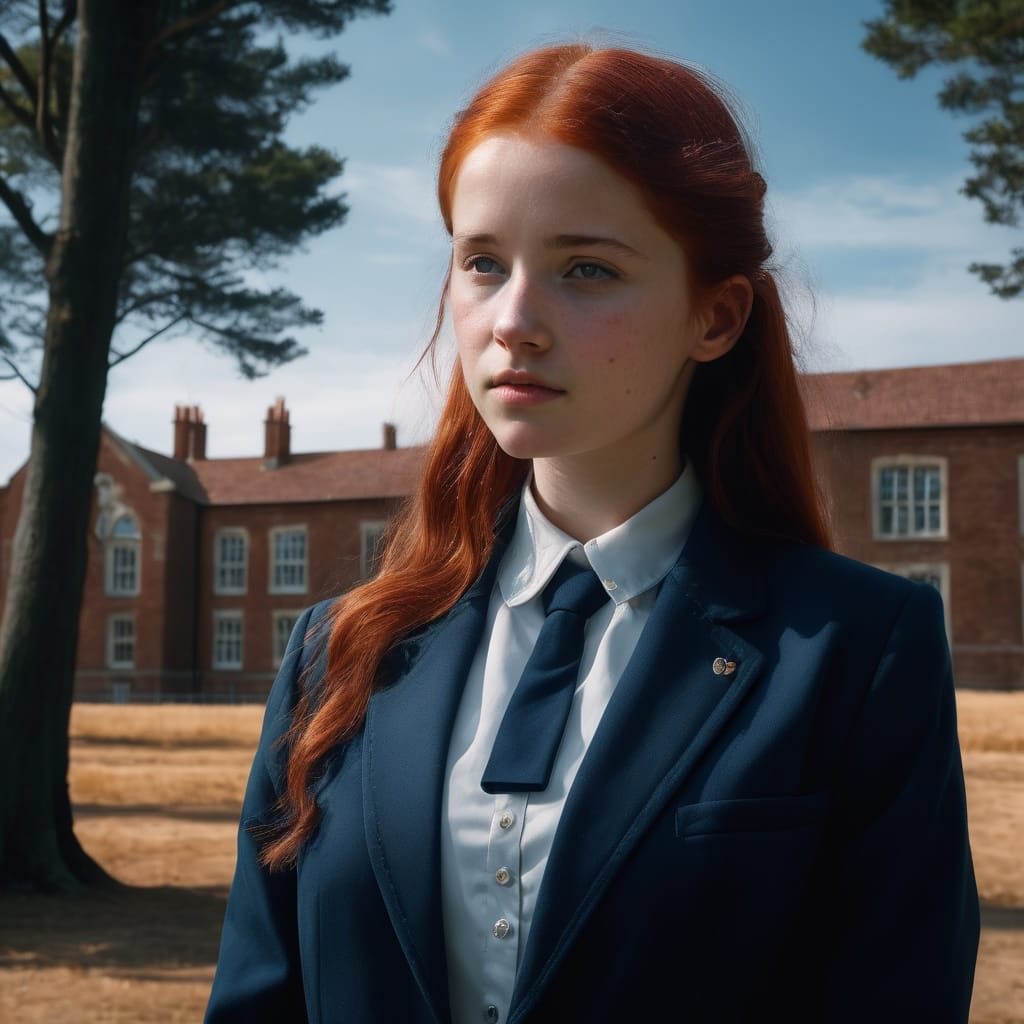
Test 05
第五個測試是 Text G 跟 Text L 都放 A + B。女孩,校服,學校,藍天!貓咪坐在沙發!太空人在騎馬還見到月球!所有元素最齊全的一張。
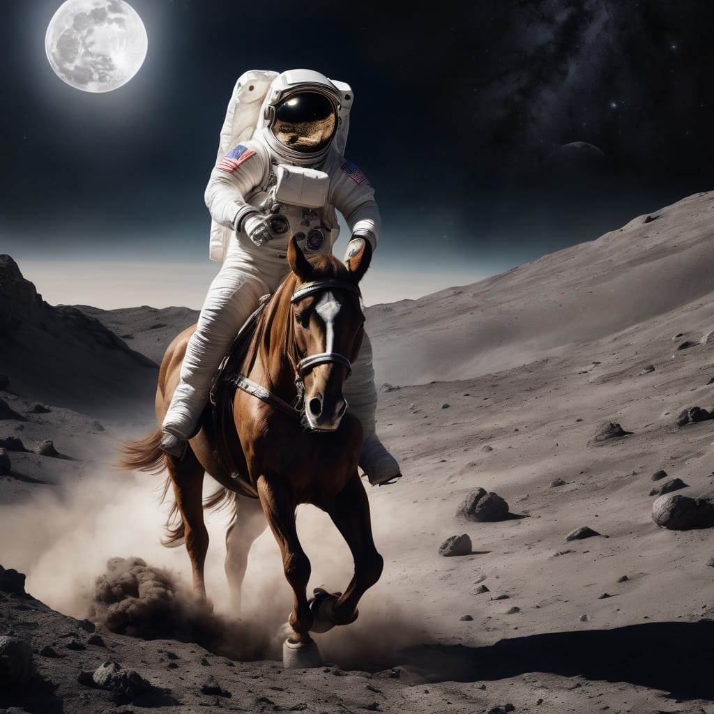
Text G: A+B, Text L: A + B
測試結果令人震測,相同的 prompts 放到不同的位置也會出現截然不同的效果,就結果而然,把所有 prompts 都放到 Text G,好像就是最好的效果(那 Text L 有什麼用?),把 Text G 及 Text L 都放相同完整 prompts 就會所有元素都好好填滿,至於那個才是你心目中想要的效果,也許要把 Text G 跟 Text L 多互換嘗試才知道了!